Why users struggle with your UX — and how heuristic evaluation can fix it
What Is Heuristic Evaluation?

Heuristic evaluation is a UX review method where we evaluate a product's interface against a set of usability principles (called "heuristics").
The most popular framework comes from Jakob Nielsen, who defined 10 usability heuristics that act as a checklist for better UX.
Think of it as giving your design a "health check" before sending it out into the world.
Why Heuristic Evaluation Matters
Why Heuristic Evaluation Matters
Heuristic Evaluation in UX: Designing Better, Faster, Smarter
As a UI/UX designer, one thing I've learned is this: a beautiful design isn't always a usable design. You can have the prettiest interface in the world, but if users get confused, frustrated, or lost — they'll leave.
That's why heuristic evaluation is one of my go-to tools. It's a simple yet powerful way to spot usability issues early — before they reach real users.

Nielsen's 10 Usability Heuristics (Simplified)
Here's a plain-English version of Nielsen's principles with quick examples:
1. Visibility of System Status
Always keep users informed about what's happening.
Example: A progress bar when uploading a file.

2. Match Between System & Real World
Use familiar words, icons, and concepts that users understand.
Example: A trash bin icon for "delete."

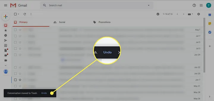
3. User Control & Freedom
Let users undo, go back, or exit easily.
Example: An "Undo" button in Gmail.
4. Consistency & Standards
Keep design patterns and terminology consistent across screens.
Example: Using the same button style.
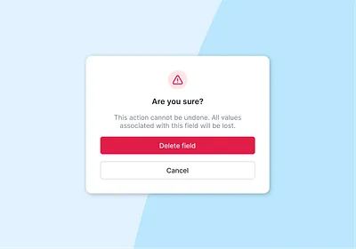
5. Error Prevention
Prevent mistakes before they happen.
Example: A confirmation popup before deleting data.
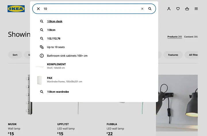
6. Recognition Over Recall
Make actions obvious so users don't have to remember steps.
Example: Auto-suggesting recent searches.
7. Flexibility & Efficiency
Allow shortcuts for experienced users while keeping things simple for beginners.
Example: Keyboard shortcuts in Figma.
8. Aesthetic & Minimalist Design
Keep things clean. Less clutter = better usability.
Example: Google's homepage — simple and focused.

9. Help Users Recognize, Diagnose & Recover from Errors
Provide clear error messages and solutions.
Example: A friendly error message illustration.

10. Help & Documentation
Make it easy for users to find guidance when needed.
Example: A quick "How it works" tooltip or FAQ section.

Why Heuristic Evaluation Matters
- It's fast → You can catch issues early.
- It's cost-effective → No need for a large user test initially.
- It's insightful → Helps you think from a user's perspective.
When combined with real user testing, heuristic evaluations make your design process smarter, smoother, and more user-focused.
Final Thoughts
Heuristic evaluation isn't just a checklist — it's a mindset. By keeping Nielsen's principles in mind, we create products that are intuitive, efficient, and delightful to use.
If you're a designer, start adding heuristic evaluations into your process. Trust me, your users (and your future self) will thank you.
Frequently Asked Questions

About the Author
Varsha
Digital Intelligence & Brand Experience
I build user-centered designs — crafting engaging digital experiences that connect people and products seamlessly